
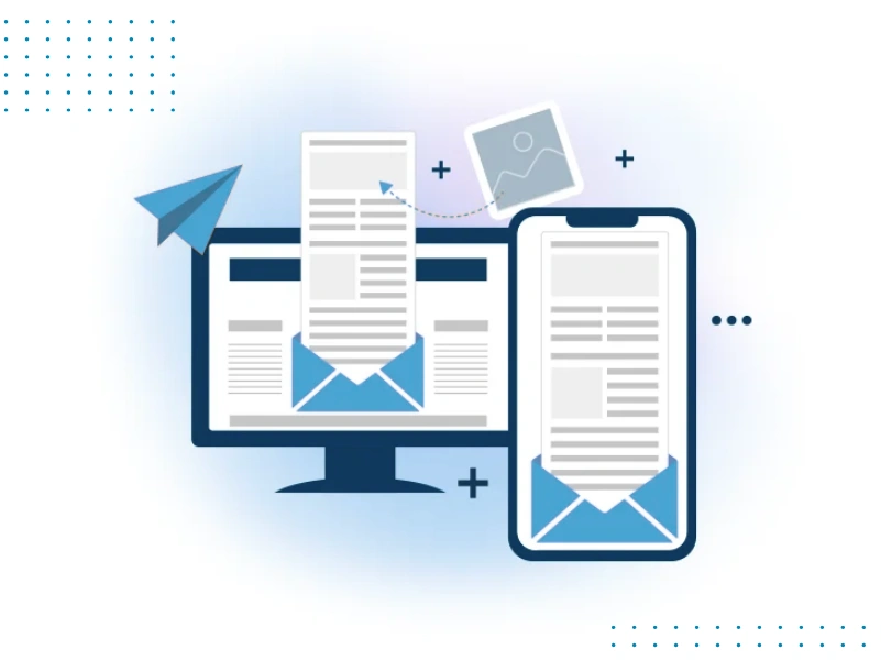
Responsive Email Design is an approach to creating emails that automatically adjust their layout and content based on the device being used to view them. With more people reading emails on smartphones and tablets, your emails must be easy to read, navigate, and engage with on any screen size.
Responsive design ensures your emails look great on all devices whether it’s a small phone, a tablet, or a desktop computer. The layout, images, text, and buttons are optimized for each screen size, providing a seamless experience for the user. This improves user engagement, increases click-through rates, and helps drive conversions. By using responsive email design, businesses can ensure that their emails are effective and accessible to their entire audience, regardless of the device they use to read them.

Why is Responsive Email Design Important?
- Mobile Usage is Increasing:With more people reading emails on mobile devices, your emails must be easy to read on smaller screens. Responsive design ensures a smooth experience across all devices, enhancing engagement..
- Improved Customer Experience:A well-designed email adapts to any screen size, making it easier for readers to interact. This improves their overall experience, keeping them engaged and encouraging them to act.
- Boost Engagement and Conversions:Responsive email design increases the chances of subscribers reading and clicking your emails. A well-designed, attractive email prompts users to take action, whether it’s making a purchase or signing up.
- Stay Ahead of the Competition:Many businesses neglect mobile optimization, but the responsive design ensures your emails stand out. This gives you an advantage over competitors who haven’t optimized their emails for all devices.
How We Create Responsive Email Designs
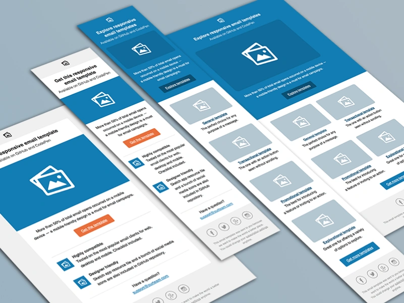
- Custom Design Tailored to Your Brand:We create emails that reflect your brand’s identity, ensuring consistency in design, colours, fonts, and images.
- Mobile-First Approach: We design emails for mobile devices first, then adjust for larger screens like tablets and desktops to ensure a smooth experience.
- Optimized for All Devices: Your emails will be optimized for smartphones, tablets, and desktops, providing a positive experience on any device.
- Simple, Clear Layouts: We focus on clean and easy-to-read layouts, making it simple for subscribers to read, click, and take action.
- Fast Loading Times: We optimize images and design elements to ensure quick loading, improving the user experience and reducing bounce rates.
Benefits of Responsive Email Design
Better User Experience
Your emails will be easy to read and use on any device.
Increased Engagement
A simple and clear layout makes it easier for readers to connect with your content.
Higher Conversion Rates
Responsive design makes it easier for your audience to click and take action.
Fewer Unsubscribes
A good mobile experience keeps users happy and reduces unsubscribes.
Boosted Brand Image
Mobile-friendly, professional emails make your business look good and enhance your brand.

Why Choose AusafTech for ResponsiveEmail Design?
At AusafTech, we create responsive email designs that look great on any device. Our team makes sure your emails match your brand and provide a smooth experience for your audience, whether they’re using a phone, tablet, or computer. We focus on mobile-first design, ensuring emails are easy to read on smaller screens. With simple layouts, fast loading, and personalized designs, we help boost engagement and results. Let AusafTech design emails that connect with your customers and drive action. Choose us for emails that deliver great results.


Ask Question

Request for Proposal (RFP)
Looking for expert solutions tailored to your business needs? Submit your Request for Proposal today, and our team will provide a detailed response.
- Fill out the form with your project details.
- Specify your requirements and expectations.
- Our team will review and respond with a tailored proposal.
Need assistance? Contact us at info@ausaftech.com.